
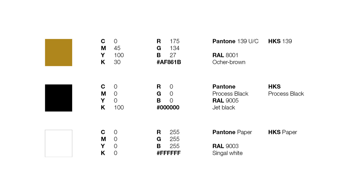
Core
In the world of branding, color plays a pivotal role in conveying a company's identity and message. Hamburger Containerboard has carefully selected three primary colors to define our identity: ocher-brown, black, and white.
Ocher-Brown: This warm and earthy hue represents the organic and natural origins of paper, reminding us of the trees and the environment that sustain our industry. Ocher-brown conveys a sense of sustainability, growth, and a deep connection to nature. It reflects our commitment to circularity.
Black: Black is a color that exudes sophistication, timelessness, and strength. In the context of the paper industry, it signifies the depth of knowledge and experience that our company possesses. Black conveys a sense of professionalism and excellence in our craftsmanship and service. It also highlights our dedication to quality, reliability, and consistency, just as the ink on a page remains unwavering.
White: White embodies purity, simplicity, and clarity. In the paper industry, white represents the canvas upon which ideas come to life. It symbolizes our commitment to providing pristine, high-quality paper products that serve as the perfect medium for creativity, innovation, and expression.
Core colors are not just a visual element; they are the essence of our brand identity. They help create a strong and memorable impression in the minds of our customers and partners. Consistency in the use of these core colors across all aspects of our branding – from packaging and marketing materials to our online presence – ensures that our image remains cohesive and instantly recognizable. These colors convey our values, commitment, and the unique qualities that set us apart in the global paper industry.
In summary, ocher-brown, black, and white are not just colors; they are the embodiment of our company's mission and values. They communicate our dedication to sustainable practices, the depth of our expertise, and the purity and quality of our products.
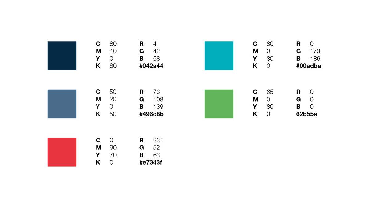
Expanded
In addition to our core colors – ocher-brown, black, and white – our branding also incorporates an array of expanded colors to provide versatility and depth to our visual identity. You can see these colors below.
These expanded colors provide a broader canvas for our brand's creative expression. They allow us to adapt and tailor our messaging to different audiences and occasions while staying true to our core identity. Whether it's through the calming shades of blue, the energetic touch of red, or the environmentally conscious hues of green, these expanded colors enrich our brand's visual language, enabling us to connect with our audience on various levels and respond effectively to the diverse challenges and opportunities in the paper industry.