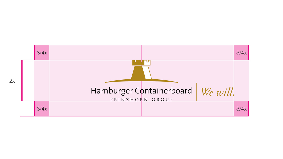
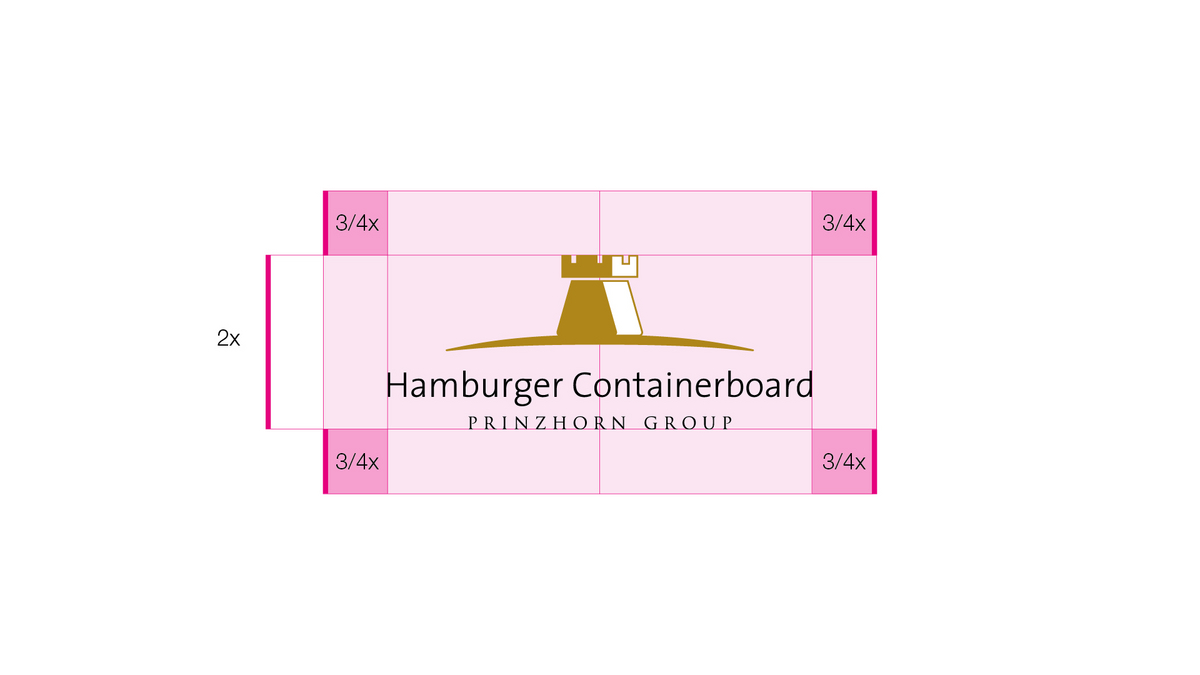
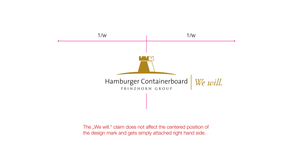
Safe Space
The free space around the brand that is specified here is part of the logo. To ensure optimum recognizability, this free space must be maintained between the brand and the next object or the edge of the next format.
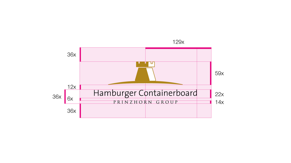
To guarantee enough space for the whole design mark, a rectangular free space must be maintained. The size of the free space is defined by the height of the company name, group name and the space between them added together.
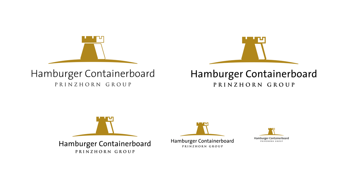
Usage small
If the logo size has to be less than 5cm in usage a special version of the logo for small applications will be used.
This version has a thicker font style for better readability as well as visibility.
An example is displayed below. You can see the original logo version on the left and the version for smaller usage on the right and below in different small sizes. You can download all versions in the download section below.
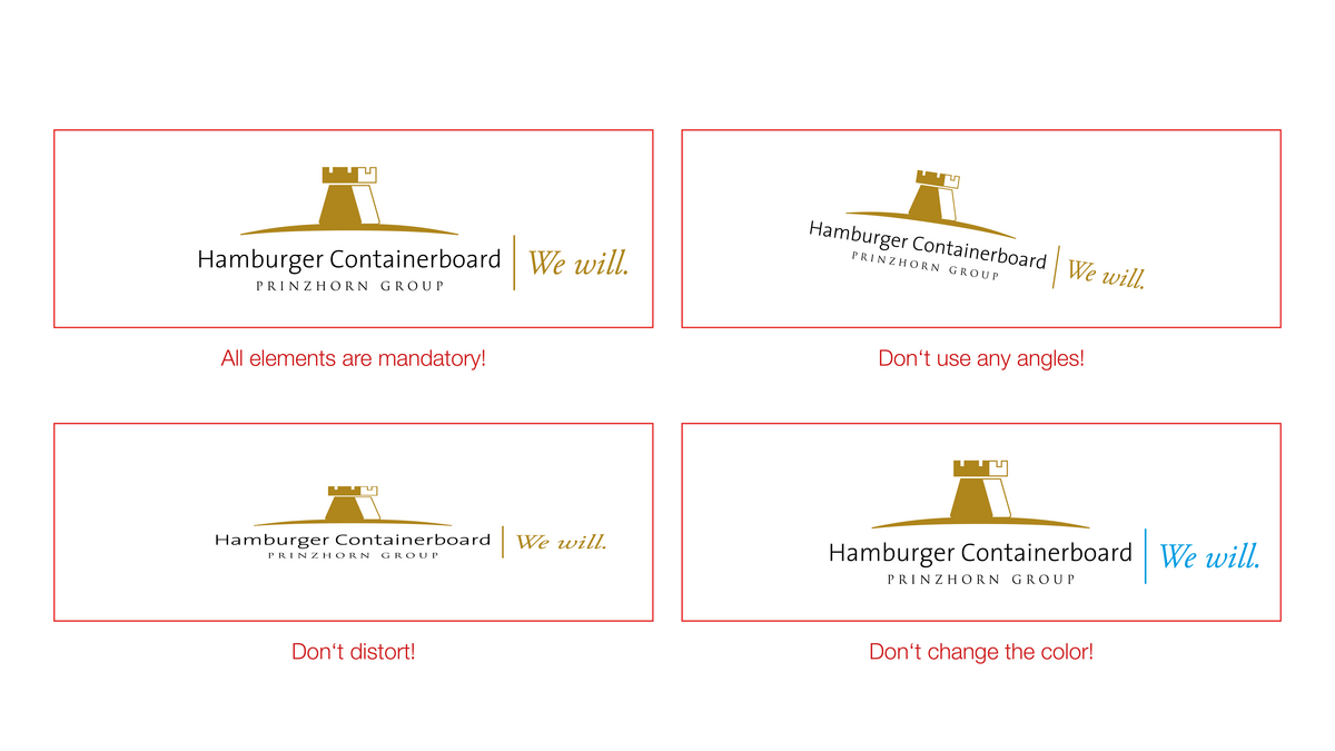
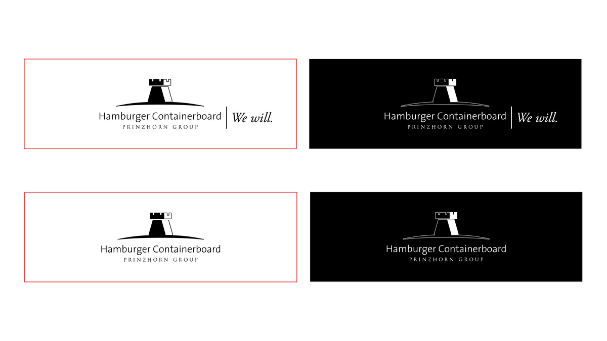
Don'ts
The logo must not be altered. No shifts within the logo or changes in its proportions or position are permitted. No colors other than those that have been defined may be used. Omissions and additions are not permitted. The logo must not be broken up (presentation in a single line).
“Busy” backgrounds that do not provide a clear contrast against the logo should be avoided.
Downloads - Logo with claim "We will."
") Logo Black RGB (jpg) (71 KB)
Logo Black RGB (jpg) (71 KB)") Logo Black RGB HQ (jpg) (170 KB)
Logo Black RGB HQ (jpg) (170 KB)") Logo Black RGB (png) (15 KB)
Logo Black RGB (png) (15 KB)") Logo Black RGB HQ (png) (35 KB)
Logo Black RGB HQ (png) (35 KB)") Logo Black RGB (svg) (20 KB)
Logo Black RGB (svg) (20 KB)") Logo Gold RGB (jpg) (71 KB)
Logo Gold RGB (jpg) (71 KB)") Logo Gold RGB HQ (jpg) (217 KB)
Logo Gold RGB HQ (jpg) (217 KB)") Logo Gold RGB HQ (png) (36 KB)
Logo Gold RGB HQ (png) (36 KB)") Logo Gold RGB (png) (16 KB)
Logo Gold RGB (png) (16 KB)") Logo Gold RGB (svg) (20 KB)
Logo Gold RGB (svg) (20 KB)") Logo White RGB HQ (png) (33 KB)
Logo White RGB HQ (png) (33 KB)") Logo White RGB (png) (15 KB)
Logo White RGB (png) (15 KB)") Logo White RGB (svg) (20 KB)
Logo White RGB (svg) (20 KB)
") Logo Print Black CMYK (jpg) (49 KB)
Logo Print Black CMYK (jpg) (49 KB)") Logo Print Black CMYK HQ (jpg) (149 KB)
Logo Print Black CMYK HQ (jpg) (149 KB)") Logo Print Black CMYK (pdf) (543 KB)
Logo Print Black CMYK (pdf) (543 KB)") Logo Print Black CMYK (ai) (1 MB)
Logo Print Black CMYK (ai) (1 MB)") Logo Print Gold CMYK HQ (jpg) (200 KB)
Logo Print Gold CMYK HQ (jpg) (200 KB)") Logo Print Gold CMYK (pdf) (544 KB)
Logo Print Gold CMYK (pdf) (544 KB)") Logo Print Gold CMYK (jpg) (721 KB)
Logo Print Gold CMYK (jpg) (721 KB)") Logo Print Gold CMYK (ai) (1 MB)
Logo Print Gold CMYK (ai) (1 MB)") Logo Print White CMYK (pdf) (536 KB)
Logo Print White CMYK (pdf) (536 KB)") Logo Print White CMYK (ai) (1 MB)
Logo Print White CMYK (ai) (1 MB)
Downloads - Logo without claim "We will."
 HCB-Logo-NoClaim-Black-Rgb.jpg(63 KB)
 HCB-Logo-NoClaim-Black-Rgb_HQ.jpg(138 KB)
 HCB-Logo-NoClaim-Black-Rgb.png(12 KB)
 HCB-Logo-NoClaim-Black-Rgb_HQ.png(27 KB)
 HCB-Logo-NoClaim-Black-Rgb.svg(17 KB)
 HCB-Logo-NoClaim-Rgb.jpg(64 KB)
 HCB-Logo-NoClaim-Rgb_HQ.jpg(157 KB)
 HCB-Logo-NoClaim-Rgb.png(12 KB)
 HCB-Logo-NoClaim-Rgb_HQ.png(27 KB)
 HCB-Logo-NoClaim-Rgb.svg(17 KB)
 HCB-Logo-NoClaim-White-Rgb_HQ.png(25 KB)
 HCB-Logo-NoClaim-White-Rgb.png(11 KB)
 HCB-Logo-NoClaim-White-Rgb.svg(16 KB)
 HCB-Logo-NoClaim-Print-Black-Cmyk.jpg
 HCB-Logo-NoClaim-Print-Black-Cmyk_HQ.jpg
 HCB-Logo-NoClaim-Print-Black-Cmyk.pdf
 HCB-Logo-NoClaim-Print-Black-Cmyk.ai
 HCB-Logo-NoClaim-Print-Cmyk_HQ.jpg
 HCB-Logo-NoClaim-Print-Cmyk.pdf
 HCB-Logo-NoClaim-Print-Cmyk.ai
 HCB-Logo-NoClaim-Print-Cmyk.jpg
 HCB-Logo-NoClaim-Print-White-Cmyk.ai
 HCB-Logo-NoClaim-Print-White-Cmyk.pdf
Downloads - Logo for small usage
 HCB_Logo_102023_1-0.svg(31 KB)
 HCB_Logo_102023_1-0.ai(1 MB)
 HCB_Logo_102023_1-0_RGB.ai(1 MB)
 HCB_Logo_Small_Gold_RGB.jpg(88 KB)
 HCB_Logo_Small_Gold_RGB-HQ.jpg(169 KB)
 HCB_Logo_Small_Gold_RGB-HQ.png(38 KB)
 HCB_Logo_Small_Gold_RGB.png(17 KB)
 HCB_Logo_Small_White_RGB-HQ.png(36 KB)
 HCB_Logo_Small_White_RGB.png(17 KB)
 HCB_Logo_Small_White_RGB.svg(16 KB)
Downloads - Logo "Connect"
 Connect_logo_rgb_1C.svg(18 KB)
 Connect_logo_rgb_1C.png(16 KB)
 Connect_logo_rgb_1C.jpg(139 KB)
 Connect_logo_rgb_1C_HQ.png(34 KB)
 Connect_logo_rgb_1C_HQ.jpg(245 KB)
 Connect_logo_rgb_1C.pdf(54 KB)
 Connect_logo_rgb_Black_HQ.jpg(152 KB)
 Connect_logo_rgb_Black_HQ.png(34 KB)
 Connect_logo_rgb_Black.jpg(92 KB)
 Connect_logo_rgb_Black.svg(18 KB)
 Connect_logo_rgb_Black.png(16 KB)
 Connect_logo_rgb_Black.pdf(54 KB)