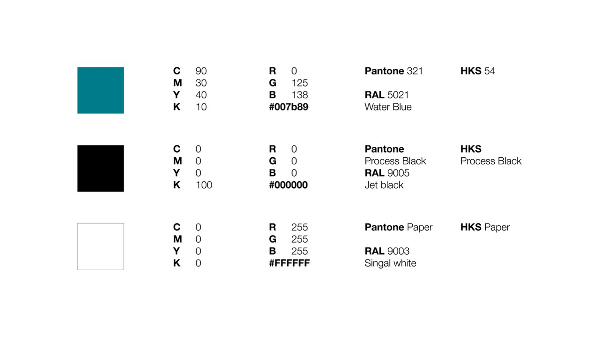
Our Purpose

Our Purpose is a way of describing how we formulate our greater role in society and the world. It is important in explaining to our employees, customers, investors and prospective employees, what we do, how we do it and what kind of value we create. Our Purpose also differentiates us from our competitors and other employers. This Purpose is now verbalized as a phrase and expressed as a visual.

Typography

The font used in the white outer ring of the Purpose logo is “Arial Regular”, while the font used in the inner blue circle is “Arial Bold”.
Only uppercase letters are used.


Logo Measurements

There is a proportional relationship concerning the Purpose logo, which is based on an invisible grid. The structure and layout are strictly defined and must not be changed. To ensure optimum recognizability, the specified free space around the logo must always be maintained. 


Illustration Sizes

The proportions of the logo must always be maintained. To ensure a consistent appearance, set image sizes apply for DIN A formats (see table below).

To ensure good legibility, a minimum height of 20 mm is stipulated. The height of the logo should not fall below this.


Color

The colors of the logo are important features of the design. Compliance with them should be ensured in all production processes and applications.

The color codes are defined. If other color systems are used, the values must be adjusted to the color information given here. The HKS color system is to be used as a reference. The colors used in the Purpose logo have the same color code as the Prinzhorn Group logo. 


Graphic Element

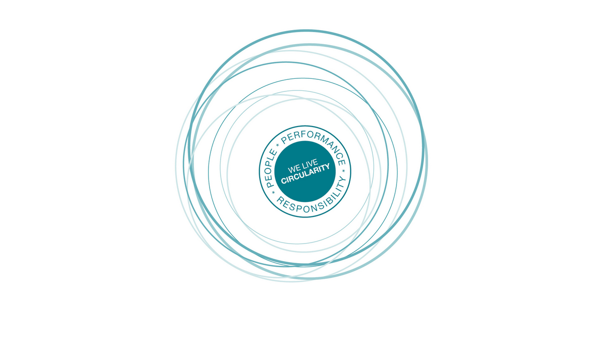
The graphic element designed for our Purpose is rendered in the form of intersecting irregular rings that carry the hues of the logo. This way, we have effectively emphasized Circularity. Its use as a graphic element is not limited in any particular way. Depending on the application area, it can be used in different scales as a whole or as a section.